Reading Graphs & Charts: How to Interpret Bar, Line, and Pie Charts Correctly
Reading a graph correctly means knowing what visual feature — position, length, or angle — actually carries the data, and checking whether the axis is being used honestly.
Reading time
— 5 min
Updated
— Aug 16, 2026
Fact-reviewed
— Aug 16, 2026
Key Takeaways
Key Takeaways
1Every graph encodes data using position, length, or angle — knowing which encoding a chart type uses is the difference between reading it accurately and being misled by it.
2The single most common way charts distort reality is a truncated (non-zero) y-axis, which can make a 2% real-world difference look like a 200% visual difference.
3Line charts show trends over a continuous variable like time, bar charts compare separate categories, and pie charts show parts of a whole that must sum to 100%.
The concept
A graph turns a table of numbers into a picture, so patterns jump out faster than they would from scanning a spreadsheet. A bar chart compares separate categories side by side using bar height or length. A line chart connects points over time to show a trend, like temperature over a week or a stock price over a year. A pie chart shows how a whole is split into parts, like a household budget split across rent, food, and savings.
Once you know which visual feature actually carries the data, the next skill is spotting when that feature is being used to mislead rather than inform — and the fastest way to see it is to compare the same real numbers plotted honestly versus dishonestly.
Quick check
A bar chart's y-axis is truncated to run from 58 to 62 instead of 0 to 62. Two bars, at values 60 and 62, are shown. What effect does this have on how the difference between them looks?
Worked examples
Example 1: Reading values directly off a bar chart (baseline case)
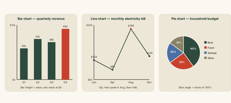
Suppose a bar chart shows a small shop's quarterly revenue: Q1 = $40,000, Q2 = $52,000, Q3 = $48,000, Q4 = $65,000, with the y-axis correctly starting at $0. Reading each bar's height against the axis gives the value directly — no calculation needed to extract the raw numbers. To find the overall change from Q1 to Q4, calculate percentage change: (65,000 − 40,000) ÷ 40,000 × 100 = 62.5% growth across the year. Note that Q3 dipped below Q2 (48,000 vs. 52,000) — a chart makes that dip immediately visible as a shorter bar, something easy to miss scanning a table of four numbers in a row.
Example 2: The same data, plotted honestly vs. misleadingly (edge case / variation)
Take two bars showing sales of 60 units and 62 units — a real difference of 2 units, or about 3.3%. Plotted on an axis running from 0 to 70, the two bars look nearly identical in height, which accurately reflects how small the difference is. Plotted on an axis truncated to run from 58 to 62, the same two bars now span almost the entire chart height, making the difference look enormous — visually suggesting something closer to a doubling. Both charts show the same underlying numbers; only the axis range changed. This is the single most common technique behind "misleading graph" examples seen in the news, marketing, and political messaging, and it's also why financial and scientific charts are expected to disclose or avoid truncated axes.
Quick check
A news article shows a bar chart with a truncated y-axis to make a 3% increase look dramatic. What is the most reliable way to check whether a bar chart's visual impression matches the real data?
Example 3: Reading a trend and its rate of change on a line chart (real-world / applied case)
Suppose a line chart plots a city's average monthly electricity bill over a year: $110 in January, dipping to $85 by April, then climbing to $190 by August (peak air-conditioning season), before settling back to $120 by December. Reading the line's shape tells the story at a glance — the dip-then-spike pattern immediately signals seasonal demand, something much harder to spot scanning twelve numbers in a table. To quantify the summer rise between April and August, calculate the rate of change: (190 − 85) ÷ (8 − 4 months) = $26.25 per month — the average steepness of that segment of the line, also called its slope. A steeper upward line segment always means faster relative change over that stretch, regardless of the specific numbers involved.
How it works (visual)
Three chart types and what each one encodes
Notice that the bar chart and line chart both anchor every value to the same vertical axis — that shared reference line is what makes position and length comparable at a glance, and it's exactly what a truncated axis breaks. The pie chart has no shared linear axis at all; each slice's angle is only meaningful relative to the full circle, which is why pie charts stop being readable once there are more than about five or six slices — the eye can no longer reliably compare similar-sized angles.
Common mistakes
Common Mistakes
✕
Assuming a bar chart's y-axis always starts at zero, and reading bar height as directly proportional to value without checking.
→ Glance at the axis labels first. If the axis doesn't start at zero, mentally rescale — or better, look up the actual numbers before trusting the visual impression.
✕
Treating a strong visual correlation between two lines on a chart as proof that one causes the other.
→ A shared trend can come from a third factor driving both, from coincidence, or from a genuine causal link — the chart alone can't tell you which. Look for the underlying explanation before concluding cause and effect.
✕
Eyeballing pie chart slices to judge which is bigger when several slices look close in size.
→ Angle and area are hard for the eye to compare precisely — check the printed percentage labels instead of trusting a visual size comparison, especially for slices that look similar.
Common misconception
“If two lines on a graph rise and fall together, one of them must be causing the other.”
A shared pattern on a chart — correlation — is not proof of cause and effect. The classic textbook example: ice cream sales and drowning deaths both rise and fall together across the year, tracking almost perfectly on a chart. Ice cream doesn't cause drownings — a third factor, hot summer weather, independently drives both more ice cream purchases and more swimming (and therefore more drowning risk). Reading a chart can reveal that two things move together; it can't by itself tell you why, and assuming "why" without further evidence is one of the most common misreadings of a graph.
Quick check
A chart shows that towns with more fire trucks dispatched to a fire also tend to have more fire damage. A headline claims 'fire trucks cause more damage.' What's the actual explanation?
Try it yourself
Rate of change (slope) between two points on a line chart
Rate of change (y per unit x)26.25
What to do next
What to do next
Before trusting a bar chart's visual impression, check where the y-axis starts — if it isn't zero, mentally discount how dramatic the difference looks.
Practice reading percentage change directly from two points on a chart, the way Example 1 does, instead of eyeballing 'looks like a lot' or 'looks like a little.'
Next time a headline links two trending lines on a chart, ask what third factor could be driving both before accepting a cause-and-effect claim.
Read the related entry on Probability Basics to see how the same 'don't trust your gut, check the math' habit applies to chance and odds.
FAQ
FAQ
Related terms
Related terms
Axis
A reference line on a graph (usually horizontal x-axis and vertical y-axis) marked with a scale that values are measured against.
Truncated axis
A y-axis that doesn't start at zero, which can make small real differences between bars or points look visually much larger than they are.
Bar chart
A chart that compares separate categories using the length of rectangular bars, measured against a shared axis.
Line chart
A chart that shows how a value changes over a continuous variable, usually time, by connecting data points with a line.
Pie chart
A chart that shows parts of a whole as slices of a circle, where each slice's angle is proportional to its share of the total (which must sum to 100%).
Trend
The general upward, downward, or flat direction a data series moves over time on a line chart.
Scale
The set of evenly spaced values marked along an axis, which determines how much visual distance represents how much real change.
A news article shows a bar chart with a truncated y-axis to make a 3% increase look dramatic. What is the most reliable way to check whether a bar chart's visual impression matches the real data?
This entry was researched from public sources and drafted with AI-assisted tools, then edited — errors are still possible. Spot one, or want a topic covered? Read our disclaimer.
 KnowThis